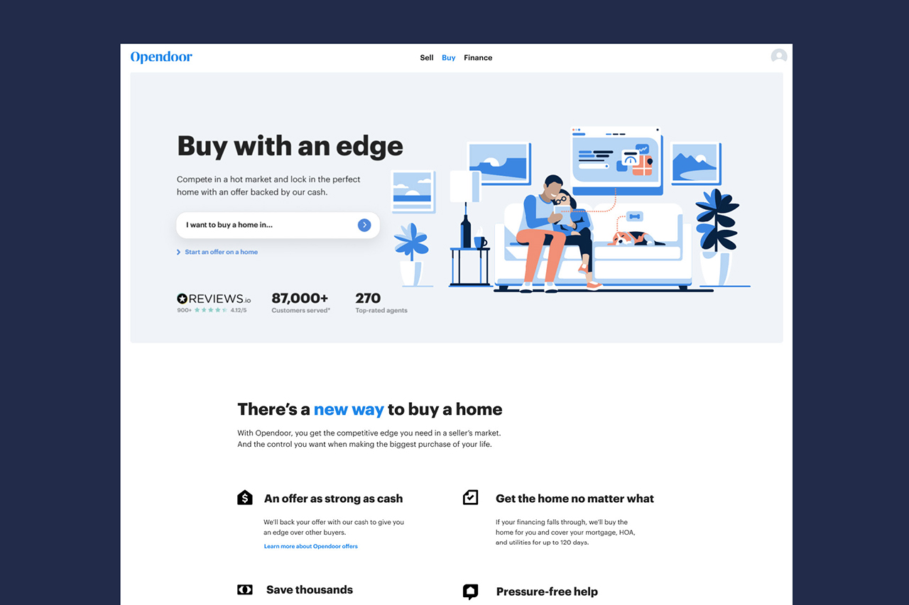
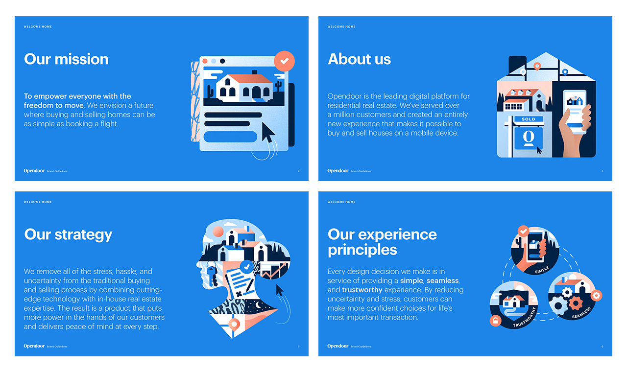
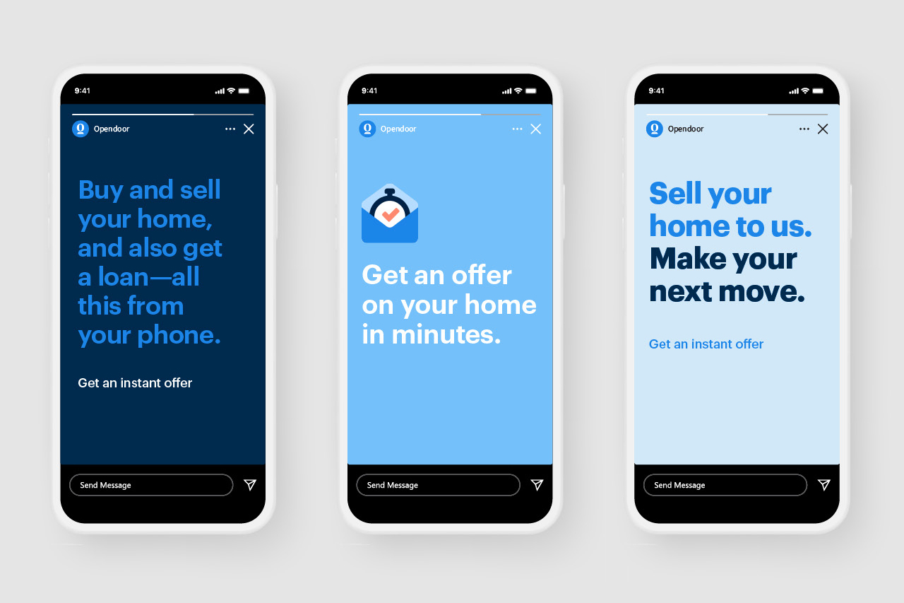
Opendoor is redesigning real estate—an entirely new way sell, buy, and move. To best connect with customers, we developed a brand persona that is knowledgable, neighborly, and straightforward. These attributes needed to come across in all touch points. From voice & tone and content, to brand identity and style, we worked across multiple touchpoints to bring these attributes to life into our core Brand Identity and guidelines.
Download the full guidelines
Role:Creative Director
Credits:Paul Smith, Jenny Pan, Nicolas Solerieu, Jonathan Holt, Opendoor Brand Studio, Opendoor Product Design
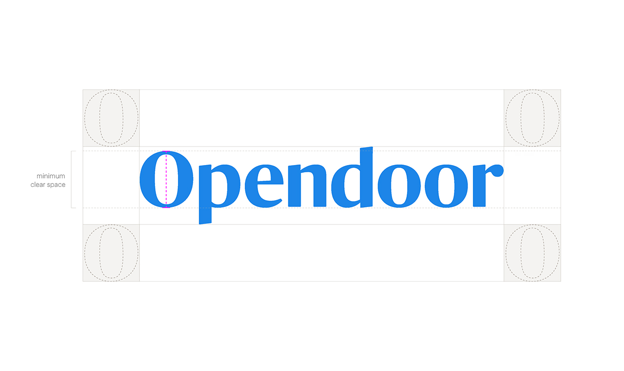
The Opendoor Logo is a customized logotype with a friendly and professional personality. It symbolizes an open and welcoming approach to home buying and selling and the world of real estate.
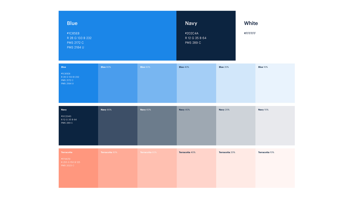
Our primary color is blue and navy. This combination is bold with depth, capturing the strength and dependability of Opendoor. We employ our brand blue whenever we connect with our customers and stakeholders to reinforce our Opendoor brand presence.
Our expanded palette includes accents, tints, and a third color, terra cotta, to warm the palette. These are available for various applications with the main objective of supporting and never overpowering our primary brand blue.
Our typography is clean and functional. We use one primary typeface, Graphik, in varying weights to represent our brand personality. It allows for a range of expressions while achieving clarity in our messaging.
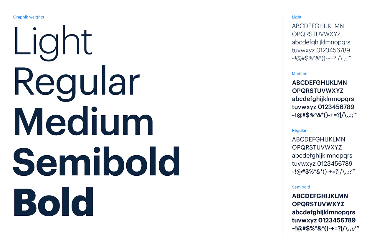
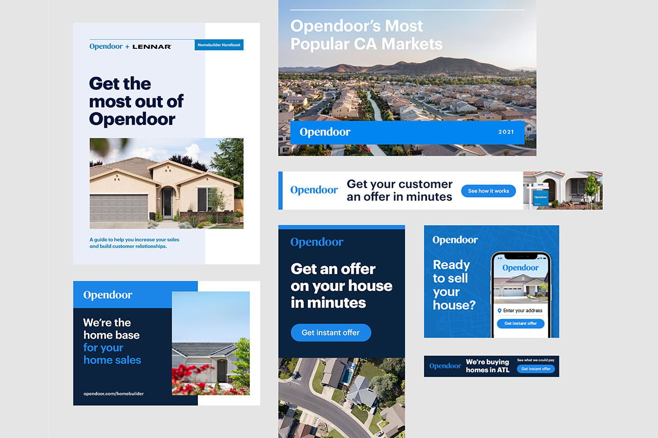
Illustration is a tool for storytelling and a vehicle to showcase our personality. It’s a brand element that allows us to convey abstract or complex ideas in simple and visually vibrant ways.